23 November 2009

14 April 2009

IS THIS YOUR LUGGAGE


I'm loving the concept over at Is this your luggage? A photographer buys lost luggage at auctions and shoots it, in hope of finding the owner. I dare you to find the nurse costume! Innocent voyuerism at it's best.

19 March 2009

"I DARE JUST ONE MAGAZINE TO PUBLISH AN ISSUE WITHOUT RETOUCHING"

The French government may pass a law requiring magazines to disclose the amount of retouching in French magazine's pages. Check out this excerpt from The New York Times.
It is definitely a hot button issue. I'm actually on both sides...
What do you think about this issue?

WHAT THE FONT

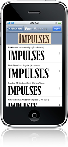
whatthefont_for_iphone

With the iPhone version of WhatTheFont you can use the phone’s built-in camera to photograph the text in question (or choose an existing image from your photo albums). The app allows you to crop the image, focusing on only the important parts before uploading. After confirming which characters are used in the image, the app provides a list of possible matching fonts. You can then either e-mail a link to a MyFonts page with more info on that font, or open it up in the iPhone’s built-in Safari web browser.

Download it for free from the App Store.

VIA SWISSMISS

06 March 2009

EAU DE AMANDA

Nico Iliev Photography

Stumbled upon this interesting article via The New York Times and Refinery 29...
Admittedly making a little mockery of the holier-than-thou celebrity fragrance industry, the creators border on that line that straddles luxury and ridiculousness.
---

A Buzz Without a Hangover

by Eric Wilson

YEARS ago, the mostly plastic, though undeniably authentic, transsexual performance artist Amanda Lepore gave up drinking, a hazard of the trade for those who make their livings in nightclubs. When she is on the clock, Ms. Lepore asks for a glass of ginger ale in a champagne flute.

Still, Ms. Lepore reeks of something bubbly, just as she did the other day when she walked into the Artware Editions gallery at 327 West 11th Street. Everywhere Ms. Lepore goes, people ask — though it may not be the first question that springs to mind — what are you wearing?

“I don’t drink, but I smell like I do,” Ms. Lepore casually announced, by way of introduction to a new fragrance that bears her name. Amanda, it is called. Like Ms. Lepore, the scent comes in a sparkly round package. It costs $950 and includes, among its many ingredients, a dash of Cristal.

Ms. Lepore, wearing a bombshell ensemble — a black Patricia Field skirt, black lace stockings and a bra from Agent Provocateur — was soon surrounded by her collaborators, Christophe Laudamiel, the perfumer; his partner, Christoph Hornetz, who designed the disco-ball-shaped bottle (together, they are known as Les Christophs); and Jon Tomlinson and Rebecca Epstein Kong, the owners of the gallery, which sells functional works by brand-name artists (bookshelves by Donald Judd; porcelain by Cindy Sherman). Amanda is supposed to be art, as opposed to, say, the weirdest celebrity fragrance ever.

“It’s not like Paris Hilton’s,” Mr. Hornetz groaned.

In 2003, Les Christophs had approached La Lepore at a party and asked if they could make a scent in her honor. It wasn’t intended to be sold commercially, Mr. Laudamiel said, but the gallery asked to make a limited edition.

This is why Amanda smells as distinctive as she does. Mr. Laudamiel started with a base of steamed rice, added mandarins, bergamot, orange flowers, strawberry and cucumber. Fittingly, the Champagne note is artificial.

“People will now recognize it, even before they see me,” Ms. Lepore said.

They might not soon forget, either, as the scent has a tendency to hang around, even when the party is over.

“It’s fermented,” she said.
---

Amanda Lepore is an absolutely fascinating character. In my circle, she is most widely recognized as the subject of David LaChapelle's lens and her promotion of MAC cosmetics and Heatherette (RIP). An echo in her own right of artistic pioneers before like Orlan, Amanda is always challenging our notions of sexuality, appropriateness, and style.

05 March 2009

STAMP OF INTENT


There's a lot of hubbub (sorry I had to use that word) going on over at the ABC news blog.

---

President Obama announced today that his administration will begin stamping an emblem on projects funded by the economic stimulus package so that people can easily recognize the effects of the American Recovery and Reinvestment Act.

All projects will be stamped with the ARRA logo (short for the American Recovery and Reinvestment Act) and lists the recovery.gov website on the emblem.

---

Readers are questioning the validity of using "taxpayer money" to design this logo. Clearly, President Obama's team understands the role and power of design in communication. This is an effort to communicate. You can argue against his recovery plan, but at least THIS administration is doing their best to stay open and inform the American people.

THRU YOU


If web 2.0 brought us authorship, what will the web 3.0 bring? Here's a fun start: mash up authorship. Thanks to danthebeast!

AWESOME MUSIC


If you're feening some new music, head over to The Walrus. They've got tons of awesome indie tracks and the inside scoop on new releases.

RAINBOW SIGHTINGS


Love the simplicity of this idea.

28 February 2009

RHYMES WITH ORANGE


new packaging

old packaging


I am amazed how many people in the design community have spent so much time analyzing the Tropicana packaging redesign (myself included). The execution was less than good at best. Still, large companies launch sub par redesigns all the time, so why such an uproar?

Over at Subtraction.com, they hit the issue right on the head: the function of color in packaging is a key element of differentiation among similar product.

This lesson learned did bring up much conversation about an agency's role and the ethics of design. Namely, did Tropicana need a redesign?

Weather any brand needs a redesign can always be disputed. The question is does a perception need to change? Design is a tool to change perception.

Some have questioned the design agency involved, and asked if the unnecessary (in their eyes) redesign raises the topic of design ethics. Only in retrospect do we question the ethics of a botched attempt.

In my opinion, a redesign was clearly needed. I am sure that Tropicana saw their customers moving organic, and it is a basic business need to recapture your customer through design. If it was a fantastic redesign, we'd be congratulating the team on a job well done and ethics would not be in question.

Rather than revert to the old packaging, it would have been nice to see the client, Tropicana, believe in the power of good design. Hand the project to another agency, one who has proven they understand how to design packaging. Change can be good and drive business results when well-executed.

P.S. Here's a great redesign round up from PSFK

23 February 2009

ARNOLDBUCKS

The Courage Campaign recently released Arnold Bucks. What a fantastic concept!

from the Courage Campaign:

California faces financial "Armageddon," as Arnold Schwarzenegger bluntly stated a few weeks ago. And yet Arnold and his fellow Republicans rejected compromises by Democrats to rescue our state from a catastrophic budget
crisis, unparalleled in the history of California. Because of the ridiculous 2/3rds budget rule -- the super-majority required to pass a budget in the California state legislature -- and Arnold's failure to deliver even one vote from a small cabal of obstructionist Republicans, Californians may be getting IOUs in the mail next month instead of financial aid checks or tax refunds. Many Californians are so overwhelmed by this paralyzing crisis that they've just tuned it out. As a result, Arnold is not being held accountable for his failure to lead.

That's why we decided to try something a bit unorthodox -- raise awareness by using humor to highlight the absurdity of these IOU's, or what we are calling "Arnoldbucks."

So the Courage Campaign asks "What will you do with your Arnoldbucks?"

Well, for one, I might just pay my taxes with it.

16 February 2009

RIP CRAFT MAGAZINE


How dang cute does Amy Sedaris look?

As the founding art director of Craft Magazine, I am {of course} partial to this publication in particular. I was part of the team that established the initial design direction, and after moving to another company, the publisher took operations in-house for the second issue. I love that they have stayed true to their indie DIY spirit.

I'm sad to report that Craft will no longer publish a print magazine. They will move all of their content online. A smart business move, for certain, but I do lament that Craft is no longer in print. Congrats to the team for a nice run, and all my best wishes for your online future.

12 February 2009

ANYONE CAN SWISS


You have to head over to Anyone Can Swiss. What a fun concept! Sometimes designers get a little full of themselves. (And I mean fashion, industrial, graphic et. al) Anyone Can Swiss breaks down that wall, with a little tongue-in-cheek humor. Any designer worth their praises should not be threatened by this idea. Rather, good designers know that Swiss (or any other style/school) is only the beginning of good design.

Congrats to Dirk+Weiss!

08 February 2009

LOVE MAGAZINE

I'm excited about the LOVE mag launch from the UK. Here's to print, may it survive!

VIA Refinery 29

ON AND OFF...

...the radar?

Recently, we had a house fire that was very scary and very real. I am posting this because I would love it if you would make sure you have a working smoke alarm (with extra batteries on hand), and a non-expired fire extinguisher.

Soapbox finished, on to design.

I found this lovely piece of safety design over at Playmedesign. Although currently a concept by Sigrun Vik, a masters candidate at Oslo School of Architecture and Design, this design is simply genius. A good looking fire extinguisher that can be kept in (plain enough) sight may be the piece of design that saves your home. (Our fire extinguisher saved our home + stuff!)


"But though it could be about life and death, the extinguisher is not a pretty object and we tend to stuff it away, instead of placing it in visible parts of our homes."

lights up in case of fire

I've been interested in the utilitarian element of safety design for some time, I have a book filled with vintage and new airline safety cards. There's something so base and lovely about public arena design, such as the London Underground maps. Still, there's so much room for improvement, especially civic design pieces for public transport. (Bay Area residents, see BART in-train ads, how Photoshop 2.0!)

The MOMA exhibit SAFE: Design Takes On Risk (check out their 2005 Flash-y website here) was an interesting collection of pieces designed for safety. Though slightly outdated, the thought behind these everyday improvements are so big, and so needed.

04 February 2009

NEW VINTAGE

fab examples of Betsey's personal style

Betsey Johnson has been an influential fashion designer and personality alike since the '70s, when she was the head of Alleycat and married to ubercool rock icon John Cale. Though of course she's a modern gal, she's going old-school again! Teaming up with Humberto Leon and Carol Lim of Opening Ceremony, Johnson is reviving the designs she created in her early days. Entitling the resurrected line "Betsey Johnson Archive", it's like vintage—but without the sketchy lineage of owners in between. Let the cartwheeling begin!

VIA Refinery 29

03 February 2009

OLSENS


A friend and I started an Olsen twin PRO/CON list. I love lists:

Props to Marcie for being hilarious.

30 January 2009

DOMINO'S DONE

the most recent issue featuring the adorable Zooey Deschanel

It is true Domino is done. The letter from the editors says it best:
---
We started with a real idea—that style is for everyone—and tried to carry it out with stories that provide inspiration and empower you to act on it. From your tremendous response, we know that we were onto something. In this tough economy, however, we simply weren't able to get the advertising support we needed.

As domino evolved, we never lost sight of our original democratic premise. Looking back at the manifesto we published in the premiere issue, the first tenet of domino is still the truest: Home should make you happy. We hope we have played a part in making this come true for you.

Love,
All the editors of domino
---

Another victim to the failing economy, yes. But this is also an example of the fact that media have to create a niche area for content that is second to none for reaching advertiser's intended audience. It is too bad Domino was not able to stay afloat. How can we restructure the old model?

UPDATE: interesting New York Times article on Domino's shuttering

ART OF PARTICIPATION

Abramović / Ulay, Imponderabilia (photographic documentation), 1977; Performance at the Galleria Communale d'Arte, Bologna, Italy, shows people passing through a doorway with 2 naked people blocking the doorway. Such an awkward exchange.

There's a great exhibit at SFMOMA called "The Art of Participation" through 2/8. Visited last night with a few friends. Our favorite piece was a rubberband net that partrons are supposed to hold out as a net. 4 women held it out, and a guy ran up and jumped into it, splatting onto the floor. I imagine it was not what he expected!

Some of my favorite comtemporary performance artists are featured like Nam June Paik and John Baldessari.

Rafael Lozano-Hemmer, Microphones, 2008; Patrons talk, sing, yell into microphones and the sounds are played back seemingly at random

29 January 2009

ART + POLITICS


love the use of type by Lance Wyman

great piece by Michael Bierut


No one can deny the power of Shepard Fairey's "Hope" poster in communicating to a younger generation. I'm awed by how many artists, famous and nameless, have been inspired by Obama. It is all positive and full of hope: head over to Danzinger Projects to view the Obama exhibition. {If you're in NYC, it's at 512 West 26th Street.}

my favorite piece by Renan Molin

LOVELY LINKS

Check out this lace fence from Demakersvan in the Netherlands.

VIA Dinosaurs and Robots

26 January 2009

LUCKY NUMBER FOURTY FOUR


Talking about "Design," can always be a little bit ethereal and, well dorky. Sometimes people don't get Design (with a capital D).

But design as a practice, can be more than a typeface. Or a Pantone color. Or a runway. Design is the architecture of a movement. Design should be seen for what it can be: a way to communicate a message.

I'm elated America understood that message. Congrats to our 44th president. May you help design America's future.


Amazing shots pulled together by The Boston Globe, thanks to my informant Ann in DC!

21 January 2009

POP JUNKIES


I'm loving these ad busted music posters from Wooster Collective. Such a fun play on the realities of manufactured pop princesses!

VIA Make
{PS. I art directed the launch issue of Craft, Make's sister magazine!}

12 January 2009

MYFONTS REDESIGN

Underware type foundry just published their case study on their redesign of the Myfonts logo. Love to see Myfonts refreshing their identity! (A much needed one for a font website.) Some would argue that Underware only has "one style", but I don't care... As long as you do one thing... do it well! Cheers to a job well done.

05 January 2009

ECOFONT


Check out ecofont, a typeface that helps save money and the environment by using less ink...genius!